
In celebration of Chocolate Skateboards’ 30th anniversary, the brand partnered with Nike SB to create the limited-edition Chocolate Sun Dunk Low and with eBay to auction them off. As the Art Director, I drew inspiration from Richard Mulder’s 2003 "Sun Series" artwork, which was incorporated into the sneaker design, influencing the visual direction of the promo shoot.
Art Direction
Adobe After Effects
This collaboration was rooted in celebrating the legacy of Chocolate Skateboards, so it was important for me to immerse myself in the brand’s history and cultural context. The goal was to create visuals that felt true to Chocolate’s identity while still aligning with eBay’s social media visual language. At the same time, the creative direction had to be practical — something a small team could execute efficiently on a tight timeline.
Our creative team was tasked with pitching visual approaches to get buy-in from the social strategy team, who were in direct contact with Chocolate. As I dove into the brand’s archives, I was struck by how deeply art and design are embedded in skateboarding culture — not as decoration, but as part of its DNA. I was especially drawn to Chocolate’s early branding and board art, which leaned bold, playful, and design-forward. That visual legacy became the backbone of the story I wanted to tell.
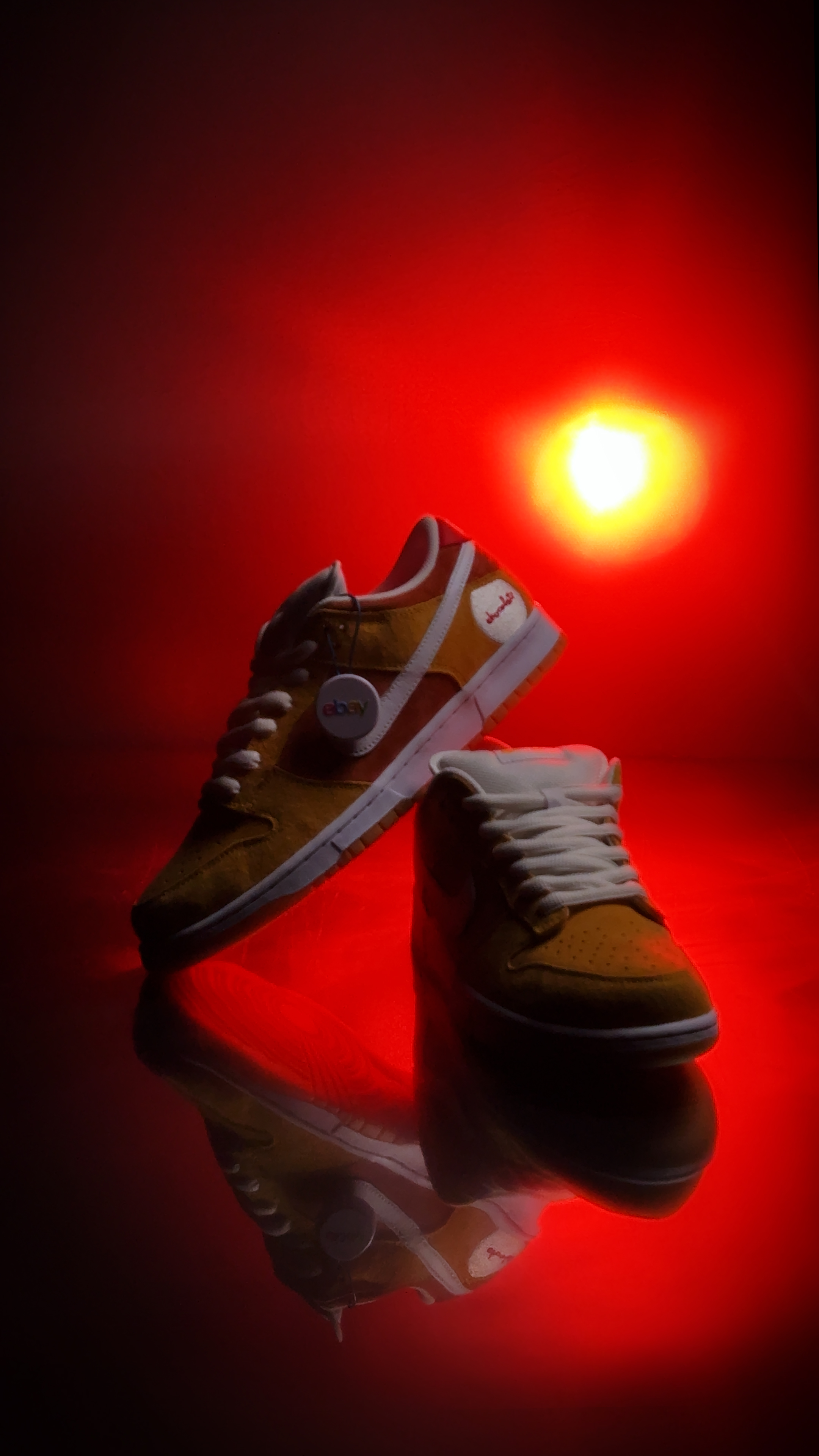
One direction I proposed was inspired by Richard Mulder’s Sun Series illustration from 2003 — a piece that also influenced the sneaker’s color palette and sole design. I envisioned using the sun’s arc as a dynamic lighting motif: casting a backlit silhouette of the shoes, with the shifting light gradually revealing details as the camera slowly moved in. The tone was meant to be minimal, cinematic, and slightly mysterious, building intrigue ahead of the full reveal in an upcoming unboxing video.
To help sell the vision, I created an AI-generated reference image using Adobe Firefly. Out of a dozen internal pitches, this was the one chosen by the strategists to move forward.
The next challenge was bringing the idea in my head into the real world. We briefly considered rendering everything digitally, but I pushed for practical effects to preserve a sense of realism and tactile quality. To help the broader team visualize it, I filmed a scrappy proof-of-concept at home using a bedsheet, a sunlamp, and a pair of house slippers. That rough mockup did the trick: it helped bridge the gap between concept and execution, and the videographer immediately saw the potential.
From there, he did an incredible job translating my vision into a fully realized shoot. Together, we refined the production setup: a diffuser, a sunlamp, reflective film, and a dolly to create the slow push-in. During test runs, we found that the backlighting made the shoes too dark. Working with the production assistant, we added overhead lighting programmed to fade in and out in sync with the sun’s path, manually operated behind the diffuser to create a natural, layered lighting effect. I handled the postproduction to help tighten up the details.
The final teaser outperformed every other boosted post in the campaign — despite being fully organic — with higher engagement and stronger viewer retention. At the launch event, the founders of Chocolate and Richard Mulder himself shared how much they loved the video and how well it captured the spirit of the brand. Their reaction made the entire process feel especially meaningful, and was a standout moment in the project.